07 Feb Zara’s new logo suggests a change of positioning
Whiplash Team. February 2019
Zara’s new logo suggests a change of positioning
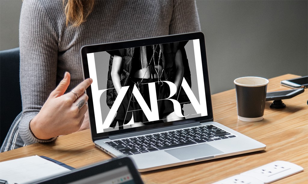
January was coming to an end when ZARA surprised the market with a new logo.
Opinions for and against aroused soon enough, and as often happens lately, Twitter and other social networks were the battlegrounds for detractors and defenders to throw their arguments about Inditex’s flagship brand new image.
BrandSmith’s Creative Director Miguel García Machín explains that the change reflects a new, more aspirational and luxury market positioning for the Spanish firm: “These typographies –Didot or Bodoni like– already used by the end of the XVIII, have been widely applied in the luxury fashion segment; with this new logo ZARA seeks to position itself in the niche of the big brands”. While a trend towards uniformity is coming about with brands adopting black logos with san serif fonts, clean, clear, bold, simple and somewhat open in their kerning –Balenciaga, Celine, Burberry, Saint Laurent, Fendi etc.–, “ZARA goes countercurrent returning to the tradition of the “bodonian” serif typefaces, so elegant and typical of the world of fashion and luxury accessories with a twist of aspirational vocation”, he points out.
In this typographic context in which Fabien Baron’s agency –Baron & Baron design studio, creator of ZARA’s new logo– seems to move, fundamental editorial references such as Vanity Fair, Vogue, Elle, Harper’s Bazaar as well as brands like Gucci, Bulgari, Cartier, Armani, CK and many others have been, and continue to be, in the collective imagination.
Baron & Baron design studio, whose founder Fabien Baron has helped design the logos and guard the image of a wide range of luxury brands such as Dior, Coach or Bottega Veneta, is, as already said, the author of ZARA’s new logo that follows the tendency of other firms that bear their stamp. Undoubtedly, the selection of this studio is not casual, nor is the new typography that identifies the Spanish company, and perhaps offers a clue to the new positioning pursued by the Arteixo based firm: with its elegant logo in capital letters, the new ZARA image evokes the legacy of high-end historical brands.
This is not the first time that ZARA has been restyled. Since its launch in 1975, it has changed its logo twice: in 2010, when the original logo with which the company was inaugurated was stylized and given a greater kerning; and now. And although this new logo had already been punctually used last year in communications with the press or in ZARA’s online platform, the company has now decided to implement it at all levels.
Of course, the new ZARA logo bears similarities with that of 2010. Both display ZARA’s four letters in capital letters and in a serif font. But while the previous logo had a large space between letters –kerning–, creating a feeling of lightness and minimalism, the new logo gathers all the letters, intertwining with each other.
García Machín explains that “within a universe of luxury brands that use similar typographies, in one ink, usually black, in this case, Baron & Baron has forced with determination and a certain boldness the space between the letters to gain singularity”.
Some experts, such as Elizabeth Segran, a regular contributor to the Fast Company publication, describe the effect of the new ZARA logo as “claustrophobic”. However, he points out that “it is very difficult to venture why the company has decided on this design, I understand that there are important strategic reasons that have been correctly addressed”, and concludes that, “in addition, this design has something important to its favor: the attributes to which it seems to respond, uniqueness, differentiated elegance, unusual personality and a touch of controlled rebellion. In addition, morphologically, the new logo optimizes its surface, providing greater visual footprint in all the media on which it is applied and, what is even better for a brand, a footprint not only bigger but deeper in the iconographic memory of the target audience”.

