14 Nov BrandSmith develops the visual identity for Convergence, the first Global Blockchain Congress
Whiplash Team, November 15, 2019
BrandSmith develops the visual identity for Convergence, the first Global Blockchain Congress
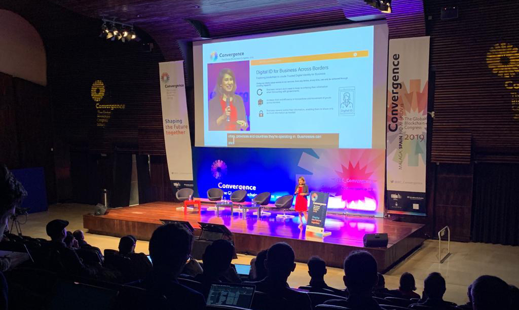
Convergence, The Global Blockchain Congress was held this week in Málaga, from November 11th to 13th. It was jointly organized by the European Commission, the Blockchain Observatory Forum, INATBA (International Association of Trusted Blockchain Applications) and Alastria.
This is the first global conference that brings together experts in blockchain, policymakers, and representatives from companies of various industries, to share ideas, experiences, and knowledge.
BrandSmith was in charge of developing the visual identity of the event and of all the visuals in FYCMA Málaga (Trade Fair and Congress Centre of Málaga), both for the congress and for the Global Blockchain Challenge competition.
Miguel García Machín, BrandSmith’s creative director, was responsible for developing the visual elements of the event. We talked to him about the creative process that entails giving a graphic identity to an event of this magnitude, which gathered more than 1.200 people from all over the world in Malaga.
WL – How did the creative process of building the graphic identity for Convergence, The Global Blockchain Congress go?
MGM – Its initial phase, the understanding of the subject itself was somewhat unique, due to the complexity of the concept: What is Convergence? What is Blockchain? Who is the communication aimed at? What is its identity? … What messages are essential? What profile does the target audience have?
In short, the usual questions that need to be tackled when dealing with any identity communication project.
Consequently, it required previous documentation work to complete the briefing and thus be able to formalize a brand and, above all, a repertoire of graphic elements that would generate, when combined, an appropriate and effective language.
WL – Why did you select that colour palette?
MGM – The colour palette is one of these graphic elements. A wide palette was chosen for the symbol with the criteria that it should cover the entire spectrum and be, in addition to balanced, visible both on a white background and on one dark blue.
The colour range is, together with typography, one of the fundamental tools to generate that visual code: the language that connects with the audience and must fulfil its duty in this kind of communication.
In the case of an event, the chosen language must connect emotionally with the audience, especially in the communicative phase prior to the event itself.
During the event, this language must also have a functional dimension, it must be clear and help the attendees to understand the direction, the situation of different areas, the activities carried out in them … etc.
WL – And the fonts?
MGM – Stick fonts were chosen, but with a kind, human touch. Typefaces typical of a contemporary language but far from the purely technological:
UBUNTU and DTL PROKYON
WL - What was the biggest challenge when developing Convergence’s identity?
MGM – Perhaps the fact that, with rather short timing, when the speeches program, the different pieces and the different supports were being generated, at the same time the communicative requirements that needed to be resolved were being discovered. Also the number of different types and formats of said media.
WL – What is the difference between developing a job like this, for an event, and doing it for a company?
MGM – If you mean the difference in branding of what is the Corporate Identity and Brand Image for an event, in principle, although they are of a different nature, and the Corporate Identity includes the Brand Image as one of its parts, from a creative point of view they have much in common. The creative phases are the same but may be shorter or longer.
Anyway, we can say that an event requires a brand image, but its implementation is more concrete and responds to a much more limited communication need in space and especially in time.
When designing an exhibition space, or an event for a fair, it is essential to have previous physical relationship with said space, understand it, preview the needs that the user may have and thus, through design, facilitate their experience in a way that it unfolds naturally and intuitively.
BrandSmith develops the visual identity for Convergence, the first Global Blockchain Congress